

Est. 2019
Est. 2019
Last Updated:
October 29, 2026

Parth Gaurav
Founder & CEO


A fintech product page usually fails one of two ways. It opens with "API-first embedded infrastructure" and loses the operations lead three seconds in. Or it strips out everything technical to sound approachable, and the engineer evaluating your sandbox closes the tab because it reads like marketing wrote it alone. Neither failure is a writing problem. It's an architecture problem, and it shows up on the page before it shows up in the copy.
Lead with what changes for the customer, not how your system does it. "An API-first tax infrastructure platform for embedded filing" tells a technical buyer what category you're in and tells everyone else nothing. "Help your customers file taxes inside the product they already use, without building tax infrastructure from scratch" gives a non-technical buyer a job to picture. The technical language still belongs on the page. It just doesn't belong in the first sentence.
We see this constantly in our work with fintech clients: the instinct to open with the architecture comes from wanting to sound credible to the toughest reader in the room, usually the CISO or a staff engineer. But that reader isn't reading sentence one to decide if you're credible. They're reading it to confirm they're in the right place, then scanning for the part that actually tests your claims. Put the outcome first. Everyone, technical or not, needs that before anything else makes sense.
A reliable opening sequence: what changes for the customer, who benefits, how the product makes it possible, what evidence reduces the risk of being wrong about you. That order works whether the reader is a CFO or a backend engineer. It just means the fourth part needs to exist, which most fintech pages skip entirely.
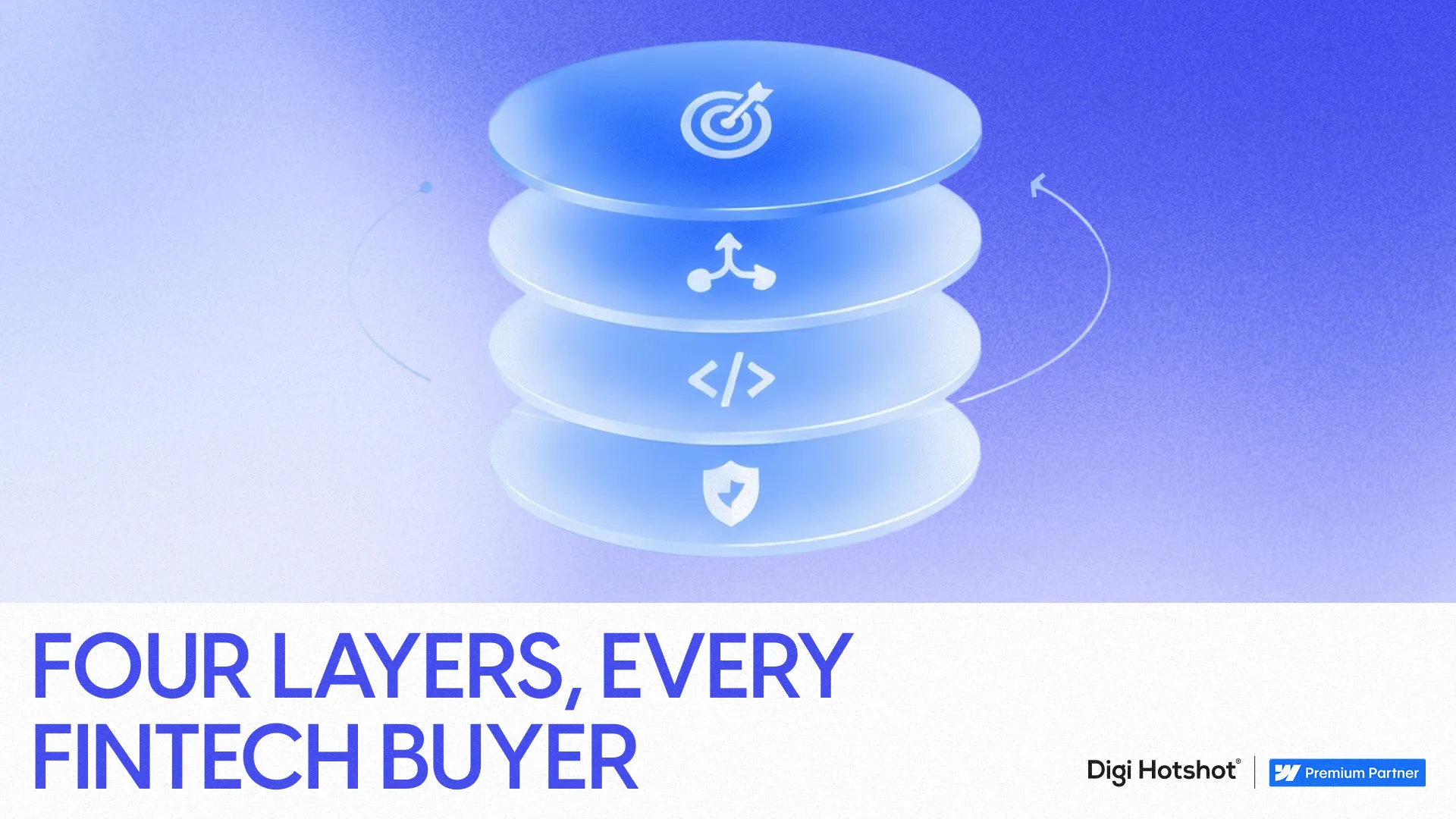
Four layers cover almost every fintech buyer: outcome, workflow, mechanism, assurance. Outcome answers why anyone should care. Workflow shows what changes day to day. Mechanism is the API, the webhook, the rules engine, the part that satisfies a technical evaluator. Assurance is security, compliance, uptime, support, the part that lets compliance and the CISO sign off without a thirty-minute call.
The mistake isn't using technical language. It's using it before you've earned the reader's attention with something they already understand. A page that opens with mechanism and buries assurance in the footer is optimized for nobody. A page that opens with outcome and never reaches mechanism loses the technical evaluator who needed to confirm you're not vague marketing dressed up as infrastructure.
This is a real split in a B2B buying committee, not a hypothetical one. A 2025 Demandbase report, produced with G2, found that 72% of B2B purchases involve complex buying groups, with companies often needing to align seven to ten stakeholders to close a deal. Your product page is rarely talking to one person. It's helping several people, with different vocabularies and different proof requirements, build a shared case to their own leadership for why this is the right call.
Pair every technical term with its practical consequence instead of replacing it with a vaguer word. "API-first" becomes "your team can connect this to an existing product instead of sending users to a separate workflow." "Idempotency" becomes "retrying a request won't accidentally create the same transaction twice." The term stays, because an engineer evaluating your product needs to see that you used it correctly. The translation gets added next to it, because the ops lead reading the same page has no reason to know what idempotency means and shouldn't have to ask.
Swapping "webhooks" for "seamless updates" doesn't make your page more readable. It makes it less specific, and specificity is what a technical buyer is actually scanning for. The fix is addition, not substitution. Say the real term. Then say what it means for the reader's day.
The same Demandbase report found that 77% of B2B buyers prioritize integration capability over standalone feature lists. Your buyer doesn't primarily want to know what your product does in isolation. They want to know what systems it touches, what data moves where, who owns implementation, and what happens when something breaks. "Modular," "embedded," and "seamless" don't answer any of that. They describe the category you're in, not the risk the buyer is trying to size up.
Security, compliance, and implementation details belong in the main explanation, not in a footer link or a PDF nobody opens. Fintech buyers aren't only evaluating what your product does. They're evaluating what it exposes them to. A page that hides SOC 2 status, encryption standards, and data handling practices behind a generic "contact us" is asking the compliance stakeholder to do extra work to find information that should have been part of the pitch.
When we rebuilt the product architecture for Column Tax, the fastest-growing U.S. tax filing startup in nearly three decades, this split was the whole design problem. Column Tax sells to accountants evaluating a workflow tool and to fintech developers evaluating API infrastructure, on the same site, often in the same sales cycle. One explanation couldn't serve both without shortchanging one side. The build gave each audience its own entry point: accountants land on workflow simplification, compliance certifications, and accounting-firm proof; developers land on API documentation previews, integration case studies, and technical specs. The outcome and the trust signals stay visible throughout, so neither path has to sacrifice credibility for clarity.
That's the piece most fintech sites get backwards. They treat the technical explanation as the "real" one and the business explanation as the marketing layer on top. Both are real. They're just answering different questions for different people in the same deal.
One page, one path, one level of detail works for simple products. It doesn't work for fintech infrastructure sold to mixed buying committees. If an accountant and a backend engineer land on the identical page and have to read the identical paragraph order, the copy ends up either too shallow for the engineer or too dense for the accountant. There's no sentence-level fix for that. It's a structural one: audience-specific entry points, a shared product explanation underneath, and technical depth available the moment the reader is ready for it rather than forced on page one.
This is also why the underlying site matters as much as the words on it. Column Tax's component-based Webflow build cut page deployment from weeks to two or three days, roughly a 90% improvement, which matters because fintech messaging doesn't get written once. New integrations, new certifications, new regulatory language, new customer proof, all of it needs to ship without queuing behind a dev sprint. We cover the information-architecture side of this in more detail in how to turn a B2B SaaS website into a sales asset, not a brochure, and the fintech-specific trust signals in our guide to Webflow for fintech companies.
The most common failure is writing the layers but keeping the old navigation, so a technical buyer still has to scroll past three paragraphs of outcome language to find your API docs. Fix the information architecture before you fix the copy. The second failure is assigning "assurance" content to legal or compliance after the page ships, so it arrives disconnected from the rest of the explanation and reads like an afterthought. Bring compliance in during the build, not after. The third is trying to solve this with one universal page when your buying committee genuinely needs two or three distinct entry points, in which case no amount of rewriting fixes a structure problem.
The real failure in fintech messaging isn't being too technical or too simple. It's refusing to let the complexity be legible, in the right order, to the right reader. Once you see your product page as four layers serving several stakeholders instead of one paragraph serving one persona, the rewrite gets a lot more obvious. If you want a second opinion on where your current page is losing one audience to serve the other, book a discovery call and we'll walk through it with you.
How much technical detail should a fintech product page include?
Enough to satisfy a technical evaluator without making it the first thing every reader hits. Use layers: lead with the business outcome, show the workflow, then give API details, data models, and integration specs their own section or path. Technical depth should be reachable within a click or two, not deleted to keep the page "simple."
Should fintech companies build separate pages for technical and non-technical buyers?
Separate entry points work better than separate pages with no shared foundation. Column Tax uses one product explanation with distinct paths for accountants versus developers, each leading with the proof and vocabulary that audience needs, while keeping trust signals and outcomes visible throughout both.
What's the biggest mistake fintech companies make in product messaging?
Opening with category and architecture language before establishing what changes for the customer. A headline like "composable embedded finance infrastructure" tells a technical buyer your category and tells everyone else nothing. Lead with the operational outcome, then earn the right to go technical.
Where should security and compliance information live on a fintech website?
In the main explanation, not the footer. Buyers evaluating fintech products are assessing exposure as much as functionality. SOC 2 status, encryption standards, and data handling practices should be visible and specific, not summarized as "enterprise-grade" or buried behind a contact form.
How many stakeholders typically review a fintech purchase decision?
Complex B2B purchases, including most fintech deals, often require aligning seven to ten stakeholders according to a 2025 Demandbase report produced with G2, which also found 72% of B2B purchases involve complex buying groups. That's why a single explanation rarely works across an entire deal.
Last Updated:
October 29, 2026
