
Est. 2019
Est. 2019
Last Updated:
September 2, 2026

Parth Gaurav
Founder & CEO
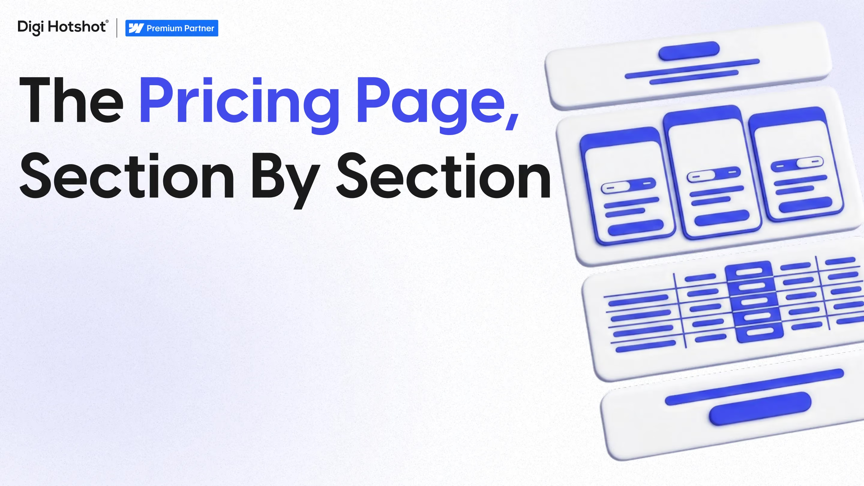


Quick answer: A B2B SaaS pricing page needs nine working parts, a promise above the fold, tier names that carry positioning, a self-selection helper, a readable comparison table, a real enterprise path, a clear billing model, an objection layer, an FAQ, and a CMS behind all of it. Most sites ship three of the nine.
By Parth Gaurav, Founder & CEO, Digi Hotshot. Last updated: August 21, 2026.
Look at where the effort goes on a SaaS marketing site. The homepage gets three rounds of design review and an argument about the hero. Product pages get a proper copy pass. The pricing page gets a table pasted in from a spreadsheet finance owns, and then it sits there for a year.
Which is backwards, because it's the highest-intent page you have. Somebody on it has already decided you might be the answer, and she's working out what it costs, which version she'd be on, and whether she can defend the number to a CFO who's never heard of you. If she can't, she doesn't email to ask. She closes the tab.
There's a second problem at $10M to $75M ARR. That's where the self-serve motion and the enterprise sales motion collide in public, on one screen, addressed to two completely different people. Most pages solve it by adding a fourth card and hoping.
Here's the whole page in one view. The last column is the useful one, because most of these failures are invisible from inside the company.
Before any number, the top of the page has one job: say what she's buying and what the price attaches to. Most pages either say nothing, a headline reading Pricing and then straight into the cards, or they paste the homepage hero back in. She's past what is this. She's on what would this cost us and can I defend it, so the line above the tiers should frame the unit you charge for, not restate a value proposition she read two clicks ago.
Tier names are positioning, not labels. Starter, Growth, Enterprise says you expect the customer to grow inside the product. Team, Business, Enterprise says you expect her to grow in headcount. Essentials, Advanced says the difference is capability, not size. Buyers read that in about a second and place themselves accordingly.
Three or four tiers is the working range. Two feels binary and pushes everyone to the cheap one, five turns the page into a spreadsheet. The names should also move when the positioning does. Vividly has been with us since 2021 and has rebuilt its homepage four times as its positioning matured, but tier names rarely get that treatment, so they end up describing a company that existed three rounds ago. If you've launched a second product since, read how that changes the site architecture first.
The most-skipped section on the page. One or two lines per tier, plain language, saying who each plan is for: Growth is for teams of 10 to 50 who need approvals, SSO and more than one workspace. Without it, buyers self-select badly. Some talk themselves into enterprise and stall in procurement for a quarter over a deal they'd have signed on a card. Others take the entry plan, hit a limit in month two, and churn. Either way your AEs end up doing the page's job on every discovery call.
This is where most pricing pages die, and the cause is always the same. Somebody exports the feature list from the product spec and ships all sixty rows.
Split features in two. There are features a buyer can evaluate, SSO, audit logs, API rate limits, seat counts, support response times, data retention. And there's inventory, everything that ships with the core product anyway and gets a checkmark in all three columns. Inventory belongs on the product pages. Keep only rows where the answer differs by tier, and group them five to seven at a time under headers she recognizes.
Contact us isn't the failure. Contact us with nothing around it is.
Take the number out of a card and you have to put something in its place, or it reads as a dead end next to three cards that answer the question. What goes there is the shape of the deal, annual contract, custom seat bands or volume, what enterprise adds that the tier below doesn't, and a hint at what qualifies. Typically 200+ seats or a regulated deployment costs you nothing and saves both sides a wasted call. Publishing a floor instead is a go-to-market call, not a design one, but either way that card's CTA has to promise something specific, the same discipline behind every other CTA on a high-consideration site.
The billing model is itself a message about who the product is for. Seats say you're pricing a team. Usage says you're pricing an outcome and expect the account to expand without a procurement cycle. A platform fee plus usage says you're selling to finance as well as to marketing. Two things break here: annual-only toggles with the monthly figure in small gray text, which reads as a trap even when it isn't, and usage units defined nowhere, credits, events, runs, MAUs. If she can't model what she'd pay next year, she can't get it approved this year.
Nobody plans this section and everyone needs it. These are the questions that stall a deal after she's decided she wants the product. SOC 2 and where the data is hosted, whether there's a DPA, what migrating off the incumbent involves, contract length, what happens to the price at renewal. Most companies have the answers, they're just sitting in a security PDF that sales attaches after the second call, about a month later than the champion needed them. Publishing them doesn't cost you a deal. It removes the gap where one goes quietly cold.
Underneath the tiers, two things: a real FAQ, and proof. Logos are fine. A customer line about the pricing being easy to model is better, because it answers the anxiety the page just created.
The FAQ matters more in 2026 than it did two years ago. When a buyer asks an AI assistant what your product costs, the answer gets assembled from whatever's machine-readable, your heading structure, your FAQ markup, and third-party sources like review sites and comparison posts. A page built as an exported image, or a hardcoded table with no structured data behind it, or a request pricing form, doesn't take part in that answer. Somebody else's does, often a competitor's, which is the same mechanism behind gated content going invisible in AI search.
This part comes from building these pages rather than designing them. From what I've seen it's the piece that decides whether everything above is still true in six months.
Pricing changes more often than any other page on a B2B SaaS site. Not the whole page, the pieces. A feature moves up a tier, a limit changes, a plan gets renamed after a positioning shift, an add-on appears, legal wants a footnote. Over a year that's a dozen small edits, each one urgent, each one too small for anybody to want to raise a ticket for. Which is exactly why they don't get made.
The split we hand clients on day one:
The comparison table is the one to get right. Built as a collection with a reference to the tier, a feature row is edited once and lands in every column. Built static, somebody changes three cells, misses the fourth, and the page contradicts itself.
Column Tax is the version I'd point at. Fintech, about four years with us now, running a component-based system that took page deployment time down roughly 90%, and their marketing team ships changes without asking us. Webflow's commissioned Forrester Total Economic Impact study puts the efficiency improvement in time to make changes and corrections to the main website at 80% for its composite organization.
Every marketing team says it wants to move faster. The pricing page is where you find out whether it can, because it changes most often and a two-week delay costs the most. If your VP of Marketing can't rename a tier on the day the positioning changes, the site isn't a sales asset your team controls. It's a system you file requests against.
We've built 50+ B2B Webflow sites since 2019, plenty of them for SaaS teams of two to six people. The ones that ship well aren't the ones with the biggest budget. They're the ones whose pricing page was built so that changing it doesn't require us. If that's the question you're sitting with, we wrote up five worth asking about your own setup.
In most cases yes, at least the structure. You don't have to publish an enterprise number, but publish the tiers, what separates them, and how billing works. Hiding all of it behind a form takes you out of the answer an AI assistant gives when somebody asks what your product costs, and that answer gets assembled from review sites and comparison posts instead.
Three or four is the working range for companies in the $10M to $75M band. Two makes the decision feel binary and pushes buyers to the cheaper option, five or more turns the page into a spreadsheet. The harder question is whether the middle tier reads as the obvious answer for your most common buyer without making the top tier look like a penalty for growing.
Three things. The shape of the deal, meaning annual contract, custom seats or volume commitments. What enterprise adds that the tier below doesn't, in specifics rather than adjectives. And a hint at qualification, a seat count or a deployment type, so a 20-person company doesn't book a call it was never going to close.
More often than teams plan for. Rarely a full redesign, but a steady run of small edits, a feature moving tiers, a limit changing, a plan renamed after a positioning shift, an add-on launching, a legal footnote. Over a year that's usually a dozen changes, each too small for anyone to raise a ticket, which is why hardcoded pricing pages drift out of date faster than anything else on the site.
Both, split by type. Values go in CMS collections: tiers, prices, feature rows, the tier-to-feature mapping, add-ons, FAQ items. Decisions stay in code: layout, toggle behavior, structural CSS, responsive rules. The comparison table matters most, because a collection with a tier reference updates every column from one edit, while a static table lets somebody change three cells and miss the fourth.
If you'd like a second pair of eyes on your pricing page, we run a free website audit, and we do the same thing for SaaS teams as part of a build. Send the URL and I'll walk it against the nine sections above, what's there, what's missing, and which parts are stuck in code where marketing can't reach them. If it's already in good shape, I'll say so and we can leave it there.
Last Updated:
September 2, 2026
Book a 30-minute discovery call. We'll discuss your current challenges and show you exactly how we can help.
Your competitors aren't stuck in developer queues. They're launching campaigns, testing messages, and capturing market share while you're waiting for simple updates.
Eliminate the bottlenecks. Give your marketing team the infrastructure they deserve—fast, autonomous, built to scale.