Est. 2019
Est. 2019
Last Updated:
May 26, 2026

Parth Gaurav
Founder & CEO
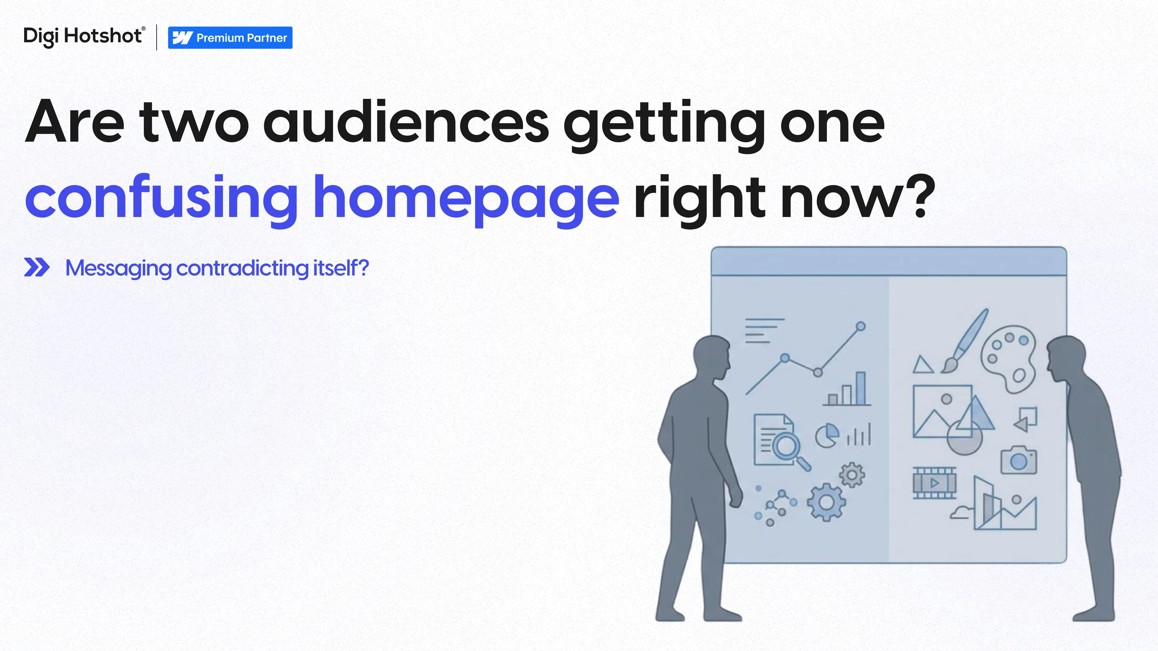


Every funded B2B company hits the same wall. The website needs to convince two completely different audiences at the same time. Product buyers want to know what it does. Investors want to know why it matters. And the same homepage has to serve both.
The two-audience problem is the challenge technical companies face when their website must simultaneously speak to operational buyers (the people who'll use the product) and financial stakeholders (investors, board members, acquirers) who evaluate the business itself. Most companies pick one audience and fail the other. Some fail both.
According to a 2024 Gartner study, 77% of B2B buyers described their most recent purchase as "very complex or difficult." Add investors to that audience and the complexity doubles.
We've solved this problem across SaaS, fintech, and healthcare since 2019. The pattern is the same regardless of industry.
Pre-funding, most company websites serve one audience: potential customers. The messaging is straightforward. Here's the product. Here's what it does. Here's why you should buy it.
Then funding happens.
Suddenly, the website isn't just a sales tool. It's a credibility signal for investors evaluating your Series B. It's the first thing a due diligence team pulls up. And those people care about completely different things than your product buyers.
What product buyers want to know:
What investors want to know:
These aren't just different questions. They require different proof points, different language, and different page structures.
The homepage leads with "Series B funded" and "backed by [VC name]." The about page reads like a pitch deck. TAM/SAM/SOM language shows up in the product section.
The problem: your product buyers don't care about your cap table. They care about whether your software does what they need. A procurement officer isn't impressed by your funding round. They want to know if the product integrates with Salesforce.
The entire site is built around conversion. Every page drives toward a demo request. The messaging is all features and benefits. Pricing is front and center.
The problem: an investor evaluating your company gets no sense of vision, market size, or competitive position. They can't tell if this is a $10M company or a $100M company.
Some companies try to solve this by creating a completely separate "investor relations" section. The product side says one thing. The investor side says another. The messaging doesn't align. It looks like two different companies.
According to a 2025 HubSpot survey, 63% of B2B buyers say inconsistent messaging across a company's digital presence reduces their trust in that company.
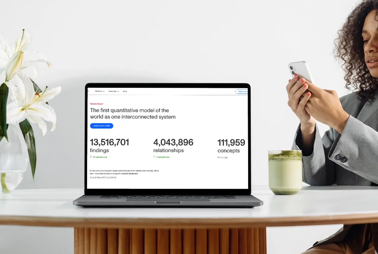
Vividly is a trade spend management platform for CPG companies. They've raised $63 million, including a $30 million Series B. Their platform manages $4.6 billion in trade spend for 2,500+ users.
The two audiences:
The key: we didn't create separate sections for each audience. We structured the information so that the same content serves both — just at different levels of reading depth. The $4.6B managed trade spend number speaks to both audiences — brand managers see scale and reliability, investors see traction.
Column Tax builds tax filing infrastructure. They've raised $26.8 million. We've been their Webflow partner for 4 years.
Accountants care about speed and reliability. Investors care about the same numbers but for different reasons — sub-3-second loads and 90% faster deployment tell them the engineering is solid.
We structured Column Tax's site so the performance metrics appear in the context of product capability (for accountants) while simultaneously functioning as proof of engineering excellence (for investors). Same data. Two readings. One page.
Sisu Clinic operates 25+ aesthetic clinics across 4 countries. They've raised $15 million.
We solved this with architecture, not messaging:
Patients never need to visit the investor pages. Investors find exactly what they need.
Write down your primary product buyer and your primary financial stakeholder. Be specific — not "customers and investors" but "mid-market revenue ops managers and Series A fintech VCs."
Read your homepage as each audience. For each audience, answer:
List every metric, logo, case study, and credential on your site. For each one, mark whether it serves Audience A, Audience B, or both. The best-performing sites have 60-70% "both" proof points.
Does your site architecture naturally guide each audience to the right pages? Product buyers shouldn't have to wade through investor content. Investors shouldn't have to dig through product documentation to find your growth metrics.
Read your product page. Then read your about page. Do they sound like the same company? If your product page says "simple workflow automation" and your about page says "AI-powered enterprise transformation platform," you've got a split personality.
Two trends are making the two-audience problem worse.
First, funding rounds are getting more competitive. According to PitchBook, the median Series B in 2025 took 14 months to close, up from 9 months in 2021. A CB Insights analysis found that 42% of investors cite "unclear positioning" as a reason for passing on a deal.
Second, B2B buying committees are getting larger. Gartner reports the average B2B purchase now involves 6-10 decision makers. Your website needs to serve all of them.
Sometimes. If your audiences have zero overlap (like patients vs. healthcare investors), architectural separation makes sense. But for most B2B companies, the better approach is dual-purpose content — proof points and messaging that read differently to each audience without creating separate silos.
Lead with the product buyer. Your homepage drives revenue. Investors are savvy enough to click through to about pages, press pages, and team pages. But weave in 2-3 credibility signals (funding amount, notable backers, growth metrics) that investors will notice without distracting product buyers.
Yes, but differently. Bootstrapped companies still face multiple audiences — product buyers and strategic partners, or technical users and business decision-makers. The framework is the same even without investor pressure.
Most funded companies should plan for a significant site update every 12-18 months, especially around funding rounds. Pre-Series A sites rarely work for Series B narratives. But a well-structured site with modular components can be updated incrementally rather than rebuilt entirely.
Making the funding round the headline. 'We raised $50M' is not a value proposition for anyone — not your customers, not your investors. Investors already know you raised money. They want to see what you did with it. Lead with traction, not capital.
Absolutely. That's what we build. Webflow's component-based architecture and CMS make it well suited for creating pages that serve different audience segments from a shared design system. We've done this across 50+ projects — it's one of the reasons we use Webflow as our primary platform.
Author: Parth Gaurav, Founder, Digi Hotshot
Last Updated:
May 26, 2026
Book a 30-minute discovery call. We'll discuss your current challenges and show you exactly how we can help.
Your competitors aren't stuck in developer queues. They're launching campaigns, testing messages, and capturing market share while you're waiting for simple updates.
Eliminate the bottlenecks. Give your marketing team the infrastructure they deserve—fast, autonomous, built to scale.